
insights
New! Survey Optimizer now has a Customizable Dashboard!
As part of our commitment to our users, we are once again investing in your success. We are proud to announce our newest feature: Survey Optimizer Dashboard
What is Survey Optimizer?
Survey Optimizer from Smart Facility Software supports your quality assurance efforts for Joint Commission compliance, black light inspections and patient satisfaction. The online software lets you easily build any survey on your desktop and conduct it in the field on your mobile device. It can be integrated with your ES Optimizer data and automatically sends completed survey data to your desktop for easy reporting.
The Survey Optimizer Dashboard
Survey Optimzier has always had comprehensive reporting capabilities where you can design and run reports on system usage and survey results. But, now your data is also available for quick viewing at the click of a button in the new Dashboard.
Dashboard Features Include:
- Ensure departments are completing surveys on a regular basis with built-in system usage graphs.
- Create custom survey results graphs for instant viewing on the dashboard.
- Export your graphs from the dashboard to be used in PowerPoint, Word or Excel.
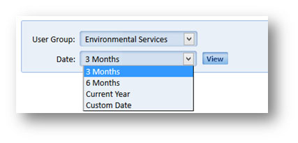
- Filter data by date range. Choose from 3 months, 6 months, Current Year or select a custom date range.
- Filter each graph on the dashboard individually by employee and/or date range.
- Create different dashboards for each department.
Here’s how it works!
Viewing the Dashboard
In Survey Optimizer, click on the “Dashboard” icon to see your dashboard.
Your Dashboard defaults to showing all system usage graphs. If you have permission to see multiple departments, choose the department dashboard you’d like to see from the User Group drop down list.
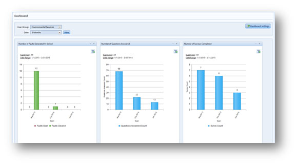
Choose a date range you would like to review.
Setting up the Dashboard
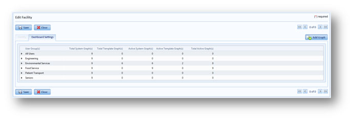
To change the charts you see in a department’s dashboard, click the “Dashboard Settings” button on the right side of your screen.
![]()
The “Edit Dashboard Settings” page will appear.
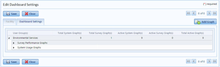
For each department there are two types of graphs to choose from:
1) System Usage Graphs — These are built-in graphic that are automatically included in all dashboards. Uncheck the checkbox next to a graph to remove it from the dashboard
2) Survey Performance Graphs — This is a list custom graphs that have been built for the department. If no custom graphs have been created, this list will be empty.
Creating Survey Performance Graphs
Click the “Add Graph” button on the right hand side of your page.
![]()
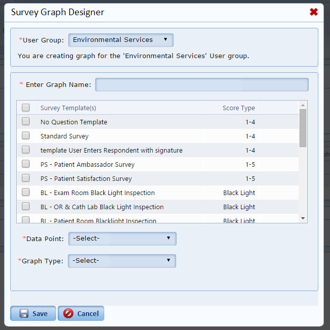
The Survey Graph Designer will appear.
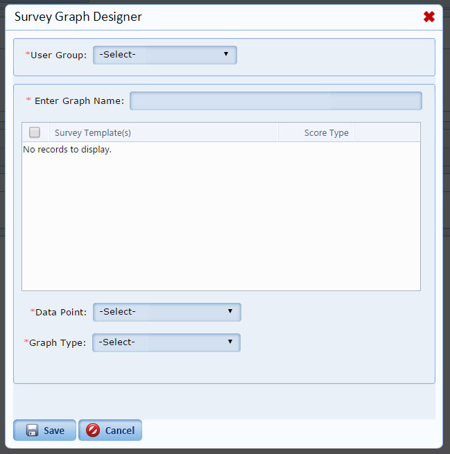
Select the user group and the list of available surveys will appear.
Check the box next to the survey for which you’d like to create a graph.
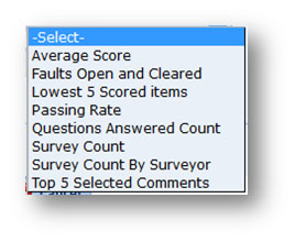
Next to “Data Point”, select the data point you’d like to report on
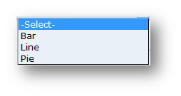
Next To: “Graph Type”: Choose from Bar Graph, Line Graph or Pie Graph
Goal Line — Set the goal line or leave it blank
Hit Save
You can create graphs for multiple surveys at once as long as the surveys all have the same score type.
You will see your new graph, listed under “Survey Performance Graphs”.
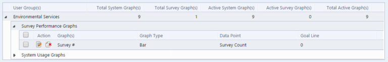
You can edit or delete the graph at any time by clicking the icons under “Action”.
To add the new graph to the department’s dashboard, check the box next to the graph.
Note: Each dashboard allows up to 9 graphs.
Close “Edit Dashboard Settings” to view the dashboard.